Australia
 Inggris
 USA
USA Canada
 Singapore
 Malaysia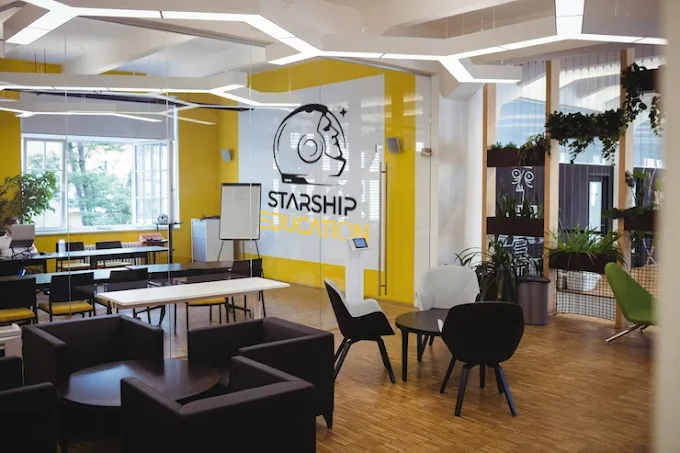
.widget.HTML#HTML6 {
padding: 0px;
}
/* =================================
VARIABEL WARNA (SESUAI starshipeducation.com)
================================= */
:root {
–primary-blue: #1e4ed8; /* Warna biru utama dari website */
–blue-hover: #0f3bb3; /* Biru lebih gelap untuk efek hover */
–accent-gold: #fbbf24; /* Aksen emas/kuning */
–gold-dark: #f59e0b;
–text-dark: #1e293b;
–text-gray: #475569;
–text-light: #64748b;
–bg-white: #ffffff;
–bg-light: #f8fafc;
–border-light: #e2e8f0;
–shadow-sm: 0 1px 3px 0 rgb(0 0 0 / 0.05), 0 1px 2px -1px rgb(0 0 0 / 0.05);
–shadow-md: 0 10px 15px -3px rgb(0 0 0 / 0.05), 0 4px 6px -4px rgb(0 0 0 / 0.05);
–shadow-lg: 0 20px 25px -5px rgb(0 0 0 / 0.05), 0 8px 10px -6px rgb(0 0 0 / 0.05);
}
* {
margin: 0;
padding: 0;
box-sizing: border-box;
}
body {
font-family: ‘Inter’, sans-serif;
background-color: var(–bg-white);
color: var(–text-dark);
line-height: 1.5;
}
.container {
max-width: 1280px;
margin: 0 auto;
padding: 0 24px;
}
/* =================================
HEADER SECTION
================================= */
.about-header {
background: linear-gradient(135deg, #f1f5f9 0%, #ffffff 100%);
border-bottom: 1px solid var(–border-light);
}
.header-grid {
display: flex;
flex-wrap: wrap;
align-items: center;
gap: 48px;
}
.header-text {
flex: 1.2;
}
.header-image {
flex: 0.9;
border-radius: 32px;
overflow: hidden;
box-shadow: var(–shadow-lg);
}
.header-image img {
width: 100%;
height: auto;
display: block;
transition: transform 0.3s ease;
}
.header-image:hover img {
transform: scale(1.02);
}
.badge {
display: inline-block;
background-color: rgba(30, 78, 216, 0.1);
color: var(–primary-blue);
font-size: 0.8rem;
font-weight: 600;
padding: 6px 14px;
border-radius: 40px;
margin-bottom: 24px;
letter-spacing: -0.2px;
}
.main-title {
font-size: 3rem;
font-weight: 800;
line-height: 1.2;
margin-bottom: 16px;
color: var(–primary-blue);
}
.subhead {
font-size: 1.25rem;
font-weight: 500;
color: var(–text-gray);
margin-bottom: 20px;
}
.description {
color: var(–text-light);
margin-bottom: 32px;
font-size: 1rem;
line-height: 1.6;
}
.contact-info {
display: flex;
flex-direction: column;
gap: 12px;
margin-top: 24px;
}
.contact-row {
display: flex;
align-items: center;
gap: 12px;
font-size: 0.95rem;
color: var(–text-dark);
}
.contact-row i {
width: 24px;
color: var(–primary-blue);
font-size: 1.1rem;
}
/* =================================
SECTION UMUM
================================= */
.section {
padding: 80px 0;
}
.section-bg-light {
background-color: var(–bg-light);
}
.section-title {
text-align: center;
margin-bottom: 56px;
}
.section-title h2 {
font-size: 2.25rem;
font-weight: 700;
color: var(–text-dark);
letter-spacing: -0.02em;
position: relative;
display: inline-block;
padding-bottom: 12px;
}
.section-title h2:after {
content: ”;
position: absolute;
bottom: 0;
left: 50%;
transform: translateX(-50%);
width: 70px;
height: 4px;
background: var(–accent-gold);
border-radius: 4px;
}
.section-subtitle {
text-align: center;
max-width: 700px;
margin: 16px auto 0;
color: var(–text-light);
font-size: 1.1rem;
}
/* Cards Grid */
.cards-grid {
display: grid;
grid-template-columns: repeat(auto-fit, minmax(300px, 1fr));
gap: 32px;
margin-top: 24px;
}
.feature-card {
background: var(–bg-white);
border-radius: 24px;
padding: 32px 28px;
box-shadow: var(–shadow-md);
transition: all 0.25s ease;
border: 1px solid var(–border-light);
}
.feature-card:hover {
transform: translateY(-6px);
box-shadow: var(–shadow-lg);
border-color: var(–primary-blue);
}
.card-icon {
font-size: 2.5rem;
color: var(–primary-blue);
margin-bottom: 20px;
}
.card-title {
font-size: 1.5rem;
font-weight: 700;
margin-bottom: 14px;
color: var(–text-dark);
}
/* Accordion (Expandable) */
.accordion-item {
background: var(–bg-white);
border-radius: 20px;
margin-bottom: 16px;
border: 1px solid var(–border-light);
overflow: hidden;
transition: all 0.2s;
}
.accordion-header {
background: var(–bg-white);
padding: 22px 28px;
cursor: pointer;
display: flex;
align-items: center;
gap: 14px;
font-weight: 700;
font-size: 1.2rem;
color: var(–text-dark);
transition: all 0.2s;
}
.accordion-header i {
font-size: 1.4rem;
color: var(–primary-blue);
transition: transform 0.2s;
}
.accordion-header:hover {
background-color: #f1f5f9;
}
.accordion-header.active {
background-color: var(–primary-blue);
color: white;
}
.accordion-header.active i {
color: var(–accent-gold);
}
.accordion-header:after {
content: ‘02B’;
font-size: 1.5rem;
font-weight: 400;
margin-left: auto;
transition: all 0.2s;
}
.accordion-header.active:after {
content: “2212”;
}
.accordion-content {
max-height: 0;
overflow: hidden;
transition: max-height 0.3s cubic-bezier(0.4, 0, 0.2, 1);
background-color: var(–bg-white);
padding: 0 28px;
}
.accordion-text {
padding: 8px 0 28px 0;
color: var(–text-gray);
line-height: 1.7;
}
/* CTA Button */
.btn-download {
display: inline-flex;
align-items: center;
justify-content: center;
gap: 12px;
background-color: var(–primary-blue);
color: white;
font-weight: 600;
padding: 14px 32px;
border-radius: 60px;
text-decoration: none;
transition: all 0.2s;
box-shadow: var(–shadow-sm);
border: none;
font-size: 1rem;
}
.btn-download i {
font-size: 1.1rem;
}
.btn-download:hover {
background-color: var(–blue-hover);
transform: translateY(-2px);
box-shadow: var(–shadow-md);
}
/* Footer */
.site-footer {
background-color: var(–primary-blue);
color: #e2e8f0;
padding: 56px 0 32px;
margin-top: 40px;
}
.footer-inner {
display: flex;
flex-wrap: wrap;
justify-content: space-between;
align-items: center;
gap: 30px;
}
.footer-logo {
font-size: 1.6rem;
font-weight: 800;
color: white;
letter-spacing: -0.5px;
}
.footer-links a {
color: #cbd5e1;
margin: 0 18px;
text-decoration: none;
font-weight: 500;
transition: 0.2s;
}
.footer-links a:hover {
color: var(–accent-gold);
}
.social-icons a {
color: white;
font-size: 1.3rem;
margin-left: 20px;
transition: 0.2s;
}
.social-icons a:hover {
color: var(–accent-gold);
transform: translateY(-2px);
}
.copyright {
text-align: center;
padding-top: 48px;
font-size: 0.85rem;
color: #94a3b8;
border-top: 1px solid rgba(255,255,255,0.1);
margin-top: 32px;
}
@media (max-width: 768px) {
.header-grid { flex-direction: column; }
.main-title { font-size: 2rem; }
.section-title h2 { font-size: 1.8rem; }
.accordion-header { padding: 18px 20px; font-size: 1rem;}
.footer-inner { flex-direction: column; text-align: center;}
.footer-links a { display: inline-block; margin: 8px 12px;}
}
PT. Starship Education Indonesia
Konsultan pendidikan terpercaya di Jakarta, mendampingi students meraih mimpi kuliah di luar negeri. Jangkauan kami meliputi Australia, UK, Kanada, Asia, Eropa, dan 50+ destinasi lainnya. Dibimbing oleh para “Astronauts” yang berpengalaman.

Tentang Starship Education
Jangkauan Global
Terhubung dengan 1000+ universitas mitra di Australia, Inggris, Amerika, Kanada, Jerman, Jepang, Korea, dan negara-negara emerging. Akses ke program beasiswa eksklusif.
Pendampingan End-to-End
Dari tes minat, seleksi kampus, urus visa sampai keberangkatan. Kami menggunakan teknologi AI Consultant untuk rekomendasi personal dan mempermudah proses aplikasi.
Para “Astronauts” Expert
Tim profesional dengan pengalaman 12+ tahun, siap membantumu mapping strategi kuliah & beasiswa. Seperti astronot menjelajah antariksa, kami bawa kamu ke destinasi edukasi impian.
Misi, Visi & Tim Antariksa
Memberikan layanan personal dan menyeluruh yang membuat setiap siswa menjalani proses studi ke luar negeri dengan percaya diri dan anti ribet. Starship Education berkomitmen untuk membuka akses pendidikan global, menciptakan pemimpin masa depan yang adaptif di lingkungan internasional, serta memaksimalkan potensi beasiswa bagi student Indonesia.
Menjadi ekosistem pendidikan lintas negara terdepan di Indonesia, yang tidak hanya memfasilitasi studi, tetapi juga membentuk generasi penjelajah — berani, berpengetahuan, dan siap bersaing global. Kami percaya setiap student adalah “starship” dengan lintasannya sendiri, dan kami adalah pusat kendali yang membantu navigasi menuju masa depan tanpa batas.
✨ Langit bukan lagi batasan, melainkan titik awal perjalananmu bersama Starship Education.
Di Starship, setiap konsultan kami disebut “Astronauts” — para penjelajah yang paham medan pendidikan global. Mereka tidak hanya menguasai persyaratan universitas dan visa, tetapi juga membawa semangat eksplorasi dan pendekatan kekeluargaan. Dengan mentor yang tepat, proses studimu di luar negeri akan terasa seperti misi yang terencana, bukan perjalanan yang menakutkan.
Siap Memulai Perjalanan?
Kami mengundang sekolah, universitas, media, dan mitra pendidikan untuk menjelajahi kolaborasi. Bagi investor yang ingin menjadi bagian dari revolusi konsultasi pendidikan, Starship Education membuka pintu investasi proyek-proyek unggulan.
500+ siswa terbantu • 98% visa success • 1000+ partner institutions
// Accordion functionality
document.querySelectorAll(‘.accordion-header’).forEach(header => {
header.addEventListener(‘click’, function() {
this.classList.toggle(‘active’);
const content = this.nextElementSibling;
if (content.style.maxHeight) {
content.style.maxHeight = null;
} else {
content.style.maxHeight = content.scrollHeight + “px”;
}
});
});
// Initialize all accordion contents to be closed
window.addEventListener(‘load’, function() {
document.querySelectorAll(‘.accordion-content’).forEach(el => {
el.style.maxHeight = null;
});
});